Description
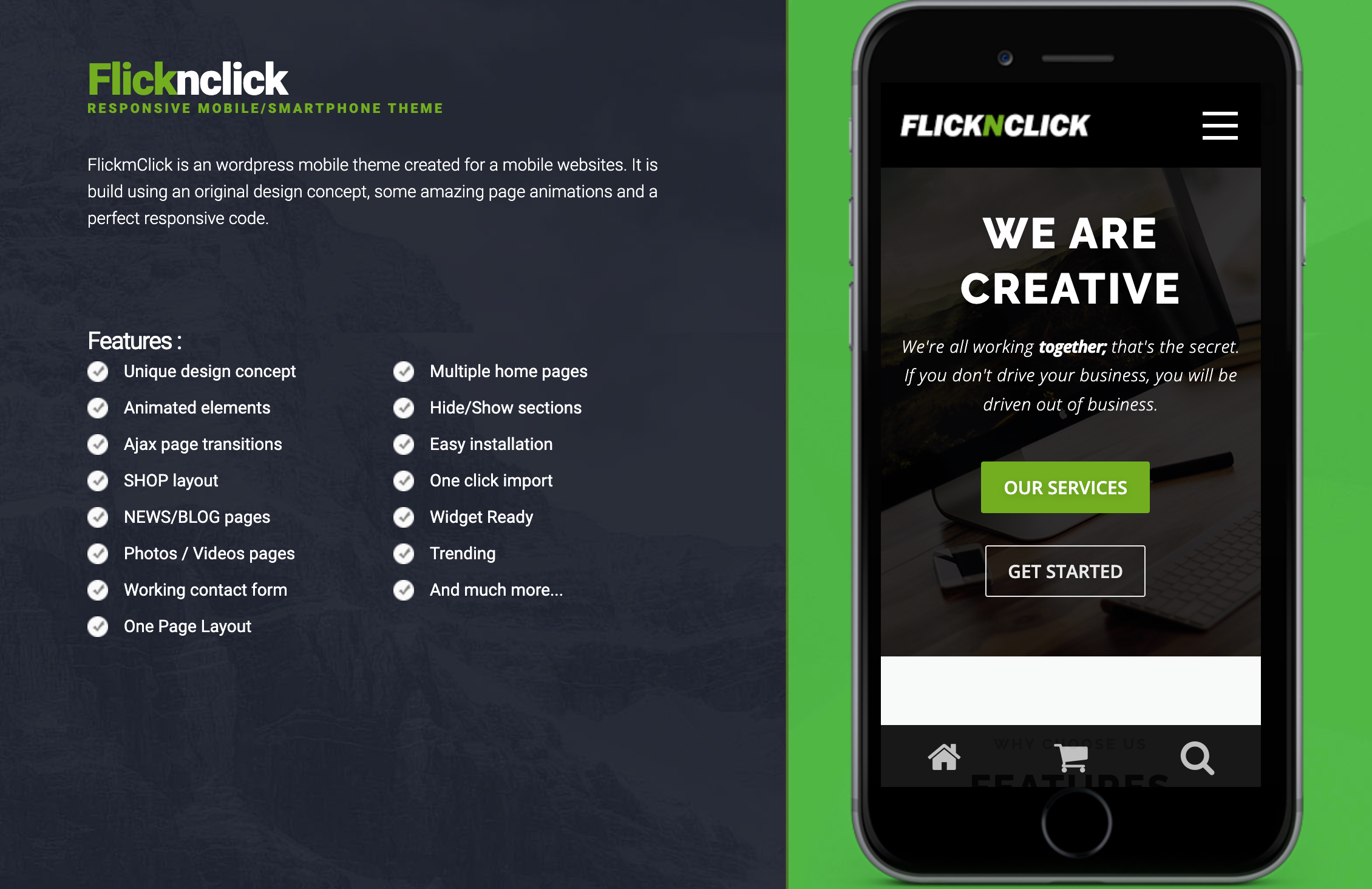
Flicknclick – Responsive Mobile/Smartphone Theme adapts to your customer’s chosen device, whether it is a smartphone (iPhone, Android) or tablet (iPad). The responsive layout adjusts to the changing mobile trends. The professional and crisp design provides a clean and simple user experience..
Flicknclick has a responsive, mobile first grid system that adapts your website to mobile devices and the desktop or any other viewing environment. Theme features One page layout template, 2 Widget Areas, Blog layouts and more. Powerful but simple Theme Options for full CMS control with easy Logo Upload and Social Networking etc. Flicknclick is WooCommerce Compatible, Multilingual Ready (WPML), Retina-Ready, Search Engine Friendly and W3C Markup Validated. Cross-Browser compatible.
If you want to dominate mobile world with mobile-friendly content, then FlicknClick is the way to go.
This template material design, modern design, clean design, clean code and easy to customize, easy to cange color and many more.
Features
- Creative Design
- Easy to Customize
- Clean Design
- Clean Code
- Many Pages
- Font Awesome
- Material Design
- Store
- Blog
- Team
- and others
- Gutenberg Optimized: No
- High Resolution: Yes
- Widget Ready: Yes
- Compatible Browsers: IE10, IE11, Firefox, Safari, Opera, Chrome
- Compatible With: WooCommerce 7.x.x, WooCommerce 6.x.x
- Software Version: WordPress 6.1.x, WordPress 6.0.x, WordPress 5.9.x, WordPress 5.8.x, WordPress 5.7.x, WordPress 5.6.x, WordPress 5.5.x, WordPress 5.4.x, WordPress 5.3.x, WordPress 5.2.x, WordPress 5.1.x, WordPress 5.0.x
- Files Included: PHP Files, CSS Files, JS Files
- Columns: 2
- Documentation: Well Documented
- Layout: Responsive
Flicknclick – Responsive Mobile/Smartphone Theme
$162
Description
Flicknclick – Responsive Mobile/Smartphone Theme adapts to your customer’s chosen device, whether it is a smartphone (iPhone, Android) or tablet (iPad). The responsive layout adjusts to the changing mobile trends. The professional and crisp design provides a clean and simple user experience..
Flicknclick has a responsive, mobile first grid system that adapts your website to mobile devices and the desktop or any other viewing environment. Theme features One page layout template, 2 Widget Areas, Blog layouts and more. Powerful but simple Theme Options for full CMS control with easy Logo Upload and Social Networking etc. Flicknclick is WooCommerce Compatible, Multilingual Ready (WPML), Retina-Ready, Search Engine Friendly and W3C Markup Validated. Cross-Browser compatible.
If you want to dominate mobile world with mobile-friendly content, then FlicknClick is the way to go.
This template material design, modern design, clean design, clean code and easy to customize, easy to cange color and many more.
Features
Related products
Gaming Community WordPress Theme
$148 Order NowBasil | Cooking Classes and Workshops WordPress Theme
$179 Order NowHUNTER – A clean & classy WordPress theme
$129 Order NowTechSmart – Helpdesk and Knowledge Base WordPress Theme
$139 Order NowBRAVE – A dark, clean, fully responsive WP theme
$140 Order NowAsk Me – Responsive Questions & Answers WordPress
$159 Order NowLilac – One-page Wedding WordPress Theme
$144 Order NowEclipse – Mobile Multi-Purpose WordPress Theme
$149 Order NowSakola | School WordPress Theme
$169 Order NowGrand College – WordPress Theme For Education
$162 Order Now