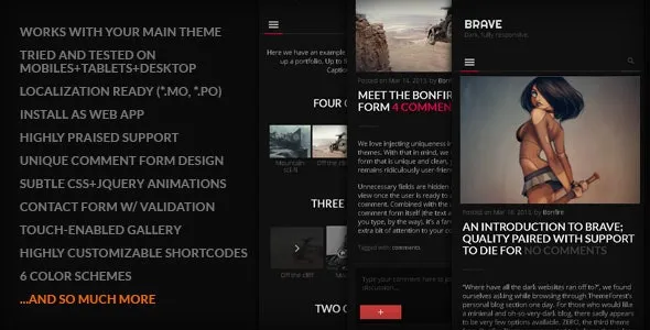
BRAVE – A dark, clean, fully responsive WP theme
$140
Beautifully dark, minimal and 100% responsive, the goal with BRAVE remains the same as it was with our previous WordPress mobile and tablet themes: keep it simple.
You’ll be hard pressed to find a single unnecessary pixel that would get between your visitor and your content. In fact, we aimed for your content to effortlessly be a big part of the actual design; as soon as you visit the demo site, you’ll no doubt immediately notice the focus on bold headlines and other well-placed content items.
- Included:Quality checked by FastSSL
- Included:Future updates
- Included:6 months support from developer
Description
BRAVE: Quality paired with support to die for
Beautifully dark, minimal and 100% responsive, the goal with BRAVE remains the same as it was with our previous WordPress mobile and tablet themes: keep it simple.
You’ll be hard pressed to find a single unnecessary pixel that would get between your visitor and your content. In fact, we aimed for your content to effortlessly be a big part of the actual design; as soon as you visit the demo site, you’ll no doubt immediately notice the focus on bold headlines and other well-placed content items.
Do read through this entire page and visit the demo site to become familiar with all the theme has to offer, but for now here’s a short list of more notable features.
- works alongside your desktop site
- ready for localization
- ‘install as web app’ on iOS
- beautifully unique menu, comment/contact forms
- touch/swipe gallery
- multiple color schemes
- a variety of extremely customizable shortcodes
- comprehensive documentation
- ..scroll down to find out much more!
BRAVE customer testimonials
You’ll always have our promise of excellent support which is something we’re massively proud of. But instead of taking our word for it, please see below for just a taste of the praise those who’ve purchased this theme have kindly sent our way:
Thoroughly tested: iOS, Android, Windows Phone, and desktop browsers
BRAVE is thoroughly tested across several browsers and devices, and to that end works beautifully across smartphones, tablets as well as desktop, allowing your visitors to easily access your site from whatever device they happen to be using at the moment.
BRAVE works alongside your existing desktop theme
BRAVE works alongside your existing desktop theme and can easily be shown to your mobile and/or tablet visitors only.
Install as a web app (use your own splash screens and icons)
As a part of the theme’s default functionality, BRAVE can be installed on your iOS device as a web app. Upon arriving on your site, a handy prompt alerts your visitor to add the site to their Home Screen, meaning your site will be just a single tap away.
You can also add your own custom icons and splash screens that the web app will make use of, as illustrated by the included default images below:
Touch-enabled gallery Swipe, pinch and zoom
BRAVE comes with a customized version of PhotoSwipe, the popular touch-enabled gallery system, which integrates absolutely seamlessly with WordPress. Let your visitors swipe, pinch and zoom their way through your images!
Theme features: The all-mighty feature list
And of course we couldn’t do without a collection of the theme’s features in neat list format:
- works alongside your existing desktop theme
- ready for translation/localization (.mo, .po files included)
- ‘install as web app‘ functionality on iOS (with install prompt, splash screens + icons!)
- easily create a phone call button and/or menu item
- tested on several browsers across multiple operating systems and devices (Chrome, Firefox, Internet Explorer, Safari, Opera, iOS, Android, Windows Phone)
- a fully responsive liquid design that works beautifully on tablets, smartphones and even scales all the way up to desktop (everything from forms and fields to menus and embedded content is automatically resized to ensure your site looks its best on whatever device and resolution it’s being viewed on)
- fully supports retina screens
- beautiful and subtle use of CSS3 and jQuery animations
- includes themes for two different slider plugins
- 6 color schemes
- touch-enabled gallery (customized PhotoSwipe)
- multiple page templates allowing for formatting of content (no title, centered title, back button, and combinations thereof)
- supports 10 post formats, complete with the option of background images (Standard, Aside, Link, Gallery, Status, Quote, Image, Video, Audio, Chat)
- a very unique, subtly animated jQuery comment form
- jQuery contact form with validation
- a ton of extremely customizable shortcodes (alerts, dividers, buttons etc)..
..plus video shortcodes for YouTube, Vimeo, USTREAM, DailyMotion, Blip.tv..
.. and shortcodes for easily placing content in columns (text, images, as well as video) - custom background tool enabled; change the theme’s background color/image in seconds (a dozen background images included)
- extensive documentation
- PSD files included
- ready-to-edit child theme included
UPDATE 1.3
- Addressed potential iOS 7 icon display issue

UPDATE 1.2
- Addressed possible WordPress 3.6 menu incompatibility

UPDATE 1.1
- Ready-to-edit child theme now included
- Updated main menu
--- An opened menu with sub items is now closed as another is opened
| Gutenberg Optimized | No |
| High Resolution | Yes |
| Widget Ready | Yes |
| Compatible Browsers | IE9, IE10, IE11, Firefox, Safari, Opera, Chrome, Edge |
| Software Version | WordPress 6.3.x, WordPress 6.2.x, WordPress 6.1.x, WordPress 6.0.x, WordPress 5.9.x, WordPress 5.8.x, WordPress 5.7.x, WordPress 5.6.x, WordPress 5.5.x, WordPress 5.4.x, WordPress 5.3.x, WordPress 5.2.x, WordPress 5.1.x, WordPress 5.0.x, WordPress 4.9.x |
| Files Included | Layered PSD, PHP Files, CSS Files, JS Files |
| Columns | 1 |
| Documentation | Well Documented |
| Layout | Liquid |
Related products
-

Wiz – Elementor MultiPurpose WordPress Theme
$159 Order Now -

Grand College – WordPress Theme For Education
$162 Order Now -

Super Coach – Life Coach WordPress Theme
$149 Order Now -

Knowledge Base – A WordPress Wiki Theme
$139 Order Now -
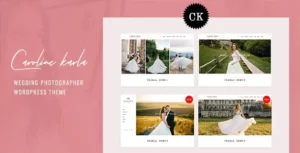
Ckarla – Wedding Photography WordPress Theme
$329 Order Now -
Gorgo – Multi-Purpose Collaborative Blog & Community BuddyPress Theme
$189 Order Now -
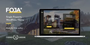
Foja | Single Property WordPress Theme
$169 Order Now -
Logistix | Responsive Transportation WordPress Theme
$159 Order Now -
HUNTER – A clean & classy WordPress theme
$129 Order Now -
Elysium – Real Estate WordPress Theme
$169 Order Now

